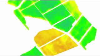
Tracking potato farming with satellite images and change analyses is … well … small potatoes!

Potato production in developing countries are rapidly increasing, with China being the largest producer by far. With ever-increasing demand for potatoes to feed the masses, new tools are needed to support farming decisions and to optimize yields. One such tool is simple change analyses on satellite imagery. The infographic below shows satellite images of a potato field acquired on two different dates (ten days apart). By visually comparing the two growth vigour images on the left it is difficult to see where and by how much growth has changed from 7 to 17 January. But when the 7 January image is subtracted from the 17 January image it is quite clear where the changes occurred. Farmers can therefore focus on these changes rather than attempting to make sense of the noisy growth vigour maps. See http://bit.ly/satellitemaps for more examples.